DESIGN
"A designer knows he has achieved perfection not when there is nothing left to add, but when there is nothing left to take away."
Antoine de Saint-Exupery
I've always been fascinated by people around me and everywhere- their dreams and subconscious motivations. Why they often say one thing, but do something else altogether. It made me embark on a quest to zoom out of the tactical design process, and focus on shaping truly actionable insights by talking to consumers and mapping out a larger and more robust vision for design, execution, communication and innovation. Conducting global research in ethnography, focus groups, in-depth one-on-one interviews in lands far and near has been extremely enriching to gain a whole new perspective on the value of a great insight as well as the measurable impact of better outcomes.
While qualitative research helps us discover which way the wind is blowing, quantitative research enables us to measure its velocity. A happy marriage of the two soundly rooted in subconscious consumer insights is key to great, strategically relevant design.
Due to the confidential nature of the recent projects, I'm unable to share them on my website. However, below is a compilation of some older work dated 2013 and earlier that I really enjoyed working on. Thank you for taking the time to stop by!:)
McDONALD'S LATE NIGHT MENU
McDonald’s fans are quite rabid. Many create their own swag to show off their love for the brand. Hats, teeshirts, hoodies you name it. To promote the late night menu, My husband and I created a fun Pajama line for the ardent fans. The pajamas would be sold through the McDonald’s website. When a fan wore it and walked into a McDonald’s after 10 p.m we would give them a complimentary order of Chicken McNuggets from the late night menu as a sign of our appreciation.
BUSINESS CARD DESIGN
I wanted my business card to be fun and reflect the dual nature of the work I do often combining visual and creative elements with research and strategic insights to generate new ideas. Here are the pictures of the process and final output
INTERACTIVE SCANDIC TEXTILE PARTITIONS
Based on a research project that spanned several months, I designed these interactive partitions with the idea of marrying Indian manufacture with Scandinavian aesthetic. Through a simple, yet ingenious process, these partitions change patterns and interact with the viewer as the light conditions change through every day, hour and minute. This was a fascinating project that seamlessly blended research, strategy and product design.
JERSEY DESIGN- INDIAN PREMIER LEAGUE
The Hyderabad Sunrisers, an Indian premier league cricket team wanted their jerseys and uniforms re-designed to be effective and stand out in media placement and during live TV. As their current uniforms were a grey that blended into the background, it was replaced with vibrant, sporty colors to represent their sunny brand.
GANJIFA TRADITIONAL COASTER SET
Art created using hand ink illustration inspired by marble inlay for circular playing cards traditionally known as Ganjifa. A project collaboration with Therefore Design to launch their Product range titled "Original Copy"
THEREFORE DESIGN, PUNE
In 2010, I had a unique opportunity to help initiate a multidisciplinary creative consultancy in Pune, India along with 4 amazing partners- Vrishali Kekre, Dhun Patel, Gauri Barve and Nitin Virkar. During this stint, I was a part of several inspiring projects detailed below.
One of my personal favorites from this time was working on some incredible Children's books in collaboration with Katha Publications. I researched and synthesized the stories, helped visualize illustration styles, selected illustrators who would work on the project and was the liason between the illustrator, Therefore Design and Katha Publications.
Below is Moon, Ramu and I illustrated by Harshvardhan Kadam that was a part of this successful collaboration. This book went on to win the Darsana National Award, 2011 for Best Children’s Book.
Another project that I was a part of was Dino long as 127 Kids illustrated by Rajiv Eipe which won the 2009 Chitrakala Award for Outstanding Creativity and was the most read book for the month of May when it was released.
Orangepeel Foodworks Pvt limited approached Therefore Design to help open the first of it's kind American Breakfast joint in Pune with the aim to take it national in a few years. I was part of the design team that helped create the branding, store interiors and customer experience touch points. An interactive wall was created with blank speech bubbles that allowed for clients to engage with the space creating a playful memorable touch. The illustrations were a collaboration with Rajiv Eipe.
PAPER BLINDS FOR AUROVILLE
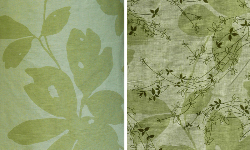
Worked in collaboration with an architecture firm in Pondicherry, India to design these vertical paper blinds. Based in the state of Tamil Nadu, India, the client, Shradhanjali, is an Auroshilpam unit of Auroville—an experimental universal township. A technique of tearing and superimposing the paper was evolved to combat the fixed sizes in which the paper is manufactured. Further, the paper was laminated in order to make it easier to maintain, clean and increase its life. A detail shows the rich paper texture with natural leaves and flowers embedded in it.
HUMAN BODY TEXTILE INSPIRATION
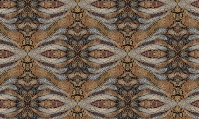
Inspired by the human body, these textile translations have been created using traditional Indian textile techniques such as block printing, batik, tie and dye or "tritik" stitch resist retaining the textural essence of the source. As a textile designer, I was fatigued by the idea that mostly flowers and foliage seek to serve as starting points for weaves and prints of all kinds. It was this thought that led me to explore the fact that inspiration lies everywhere. Even within us.
Patterns derived from the Thoracic or Rib Cage using “Batik” or “Wax Resist.”
The image below is derived from bone marrow. Inspired from the Red Blood Corpuscles and articulated through a traditional Indian technique known as “Tritik” or “Stitch Resist.”
Block Print yardage created from nerve endings and neurons.


